For several years we have been listening to customers, industry thought leaders and prospects; everyone has the same concern – people don’t use the software as intended. When we questioned them via a survey, the usability and complexity of the software turned out to be the number one evil, among several other reasons.
In 2017, our team challenged itself to make Empxtrack into an Amazingly Simple HR Software that brings “Wow” from the customer.
For several weeks the team brainstormed for the ideas of simplicity. The team studied several models and finally, we invented our patent-pending “4 Pages and 4 Scrolls” model.
Reasons for introducing “4 Pages and 4 Scrolls” Model
Our survey findings have led to the following pitfalls in enterprise software:
1. Many menus and submenus make it difficult for users to remember how they need to perform a specific function.
2. The navigation structure of enterprise software is complicated, and users need several clicks to perform various actions.
3. Enterprise software uses proprietary icons that are not intuitive. Users take help & support to understand functionality of each icon.
4. Legacy enterprise software has several pages for one action. One must move among several tabs and buttons to perform a task that has various steps.

These difficulties in using the software worsen the user’s experience. The bad experience, dissatisfaction, high learning curves, and memorability discourage users to use the software as intended by the Human Resource Department.
What is our “4 Pages and 4 Scrolls” Model?
After meticulous research, we eliminated the top 4 pitfalls of the enterprise software usability.
1. Almost Eliminated Menus: We removed the Menus and Sub-menus and replaced them with four large icons that represent the global concept of employee performance and productivity.
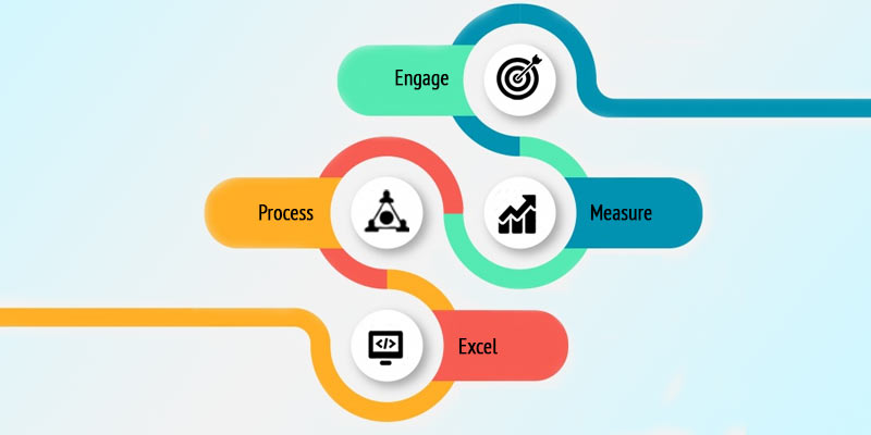
2. Limited Software to 4 Pages: We eliminated the legacy of multiple pages and reduced the entire software in Four pages. Each page dedicated to our 4-prong concept of Engage, Measure, Process, and Excel.
3. Reduced Clicks to Action: Keeping in mind the high usage of Empxtrack on mobile, we have converted multiple horizontal pages into one vertical page of 4 scrolls. Each page has four scrolls with 8-10 most essential features. So, we creatively clubbed our 40+ features into “4 Pages and 4 Scrolls”.
4. Prioritized most essential functions on top : We reorganized the “Most Important Functions” under first fold. When the user clicks on any of the 4 Pages, the most important actions are visible on the first fold.
Hence, we eliminated several elements by our UI design efforts and what remains at the end is “Amazingly Simple” Empxtrack.
How will it impact the Employee Experience?

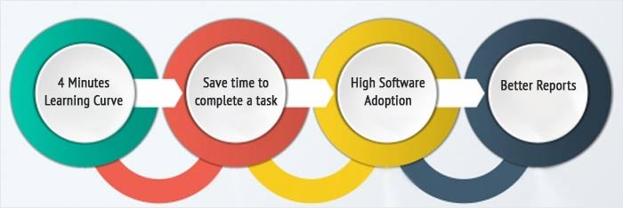
1. 4 Minutes Learning Curve: With simplified Empxtrack UI Design, users can understand the navigation and features in less than 4 minutes and start using the software instantly without additional training.
2. Save time to complete a task: The new user design is compact and organizes the features in a way that reduces time to perform any action. With Empxtrack, 80% of the essential tasks finish in less than 4 minutes and 4 clicks.
3. High Software Adoption: Our new design is poised to improve the end-user satisfaction with the software and promote the software adoption. Our research indicates to enhance adoption by 40% over our previous versions.
4. Better Reports: The higher acceptability and usage of the software helps to generate more data. The reports based on high quantity qualified data helps management to get more significant insights and helps in decision making.
Thus “Amazingly Simple” interface of Empxtrack based on patent pending “4 Pages and 4 Scrolls” principle solves the various problems of usability, user experience, and software adoption. The latest version of Empxtrack offers exciting new features that increases software usability and user engagement.


Thank you for providing useful information on why the new empxtrack HR software is amazingly simple. I enjoy reading your articles. I’m looking forward to seeing more of your work.